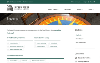
Lucius Beebe Memorial Library
Wakefield, Massachusetts
https://www.wakefieldlibrary.orgMain Platform/Tech: Wordpress
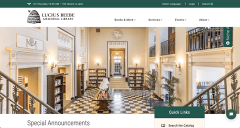
What We Like
- Bright aesthetic
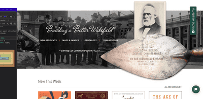
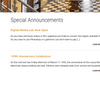
- Lead with hero image showcasing the library's inviting physical space
- Unique, playful-but-classy logo
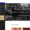
- Sub-header bar that shrinks slightly to conserve space as you scroll
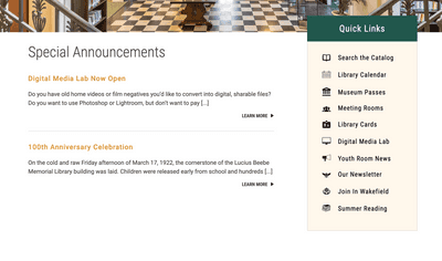
- Quick Links menu with iconography
- "Building a Better Wakefield" section that stands out on homepage and links history with current initiatives
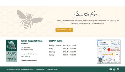
- Use of bee/hive motif, e.g. in the "Join the Hive…" newsletter call-to-action near the bottom of the homepage
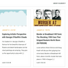
- New Arrivals and other book list components
- Generally good responsive design (on various screen sizes)
What We Don't Like
- You must scroll all the way back to the top of the page to access sitewide navigation
- Minimal footer navigation
- Some layout quirks
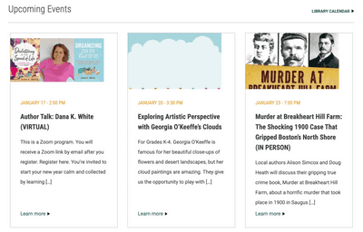
- Teaser images/thumbnails are often cropped in a poor way (TBD whether admins can customize the cropping per item in the CMS when the default is not desirable)
Other Observations
- Book lists (e.g. "New Arrivals") use imagery from, and link directly to, a NOBLE catalog entry. Hopefully website admins can assemble these lists natively in the CMS via integration with NOBLE catalog. Allowing patrons to quickly access the actual catalog entry is good, but it would also be nice to have the option to elaborate on what makes each book noteworthy (themed per website aesthetic) before sending users to the catalog.
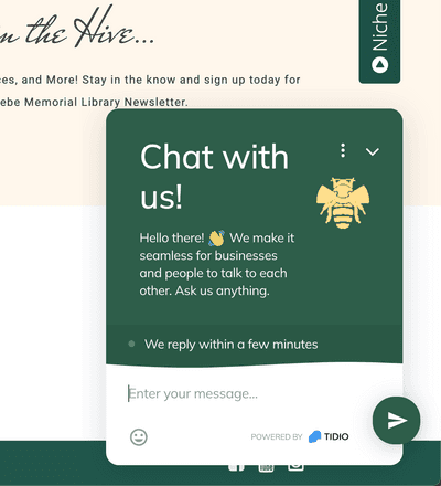
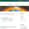
- The "Niche Academy" widget offers an intro and links to various resources. The widget has been styled to match the website theme, although the sticky tab at the right side of screen is not optimally positioned.


~
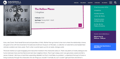
Haverhill Public Library
Haverhill, Massachusetts
https://haverhillpl.orgMain Platform/Tech: Wordpress
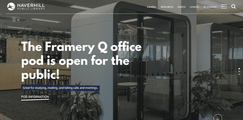
What We Like
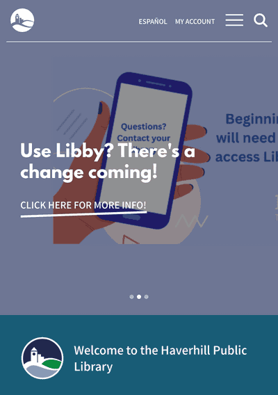
- Attractive hero area with single point of focus
- Generally good responsive design (on various screen sizes)
- Use of playful alignment and animation for button links (stylistically subjective, but makes the site feel more engaging)
- Generally sensible structure/navigation
- Good use of logo and wordmark
- Sticky header
- Attractive event promos/teasers
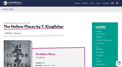
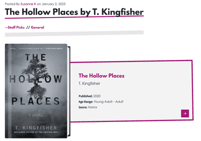
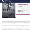
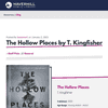
- Book reviews
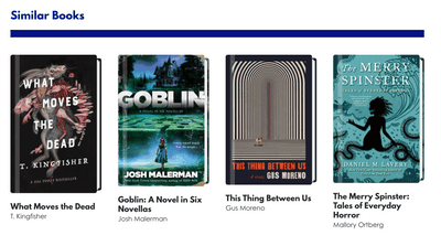
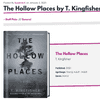
- "Similar Books" components
What We Don't Like
- Carousel in hero area can be problematic
- Some images not adapted/optimized for mobile screens
- Sticky header could be hidden when less likely to be sought after
- Event promos/teasers are not synced with Eventkeeper (e.g. the "Hellstrip Gardening" event has a 2022 date in the CMS whereas the Eventkeeper event has the correct 2023 date).
Other Observations
- Users can toggle between English and Spanish languages, though some content, e.g. book review text, is not translated into Spanish.


~
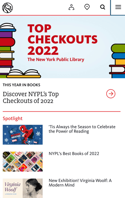
What We Like
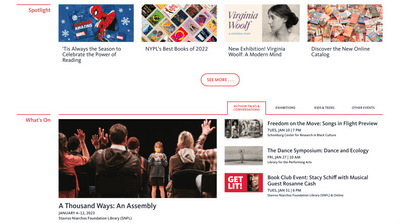
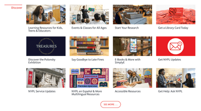
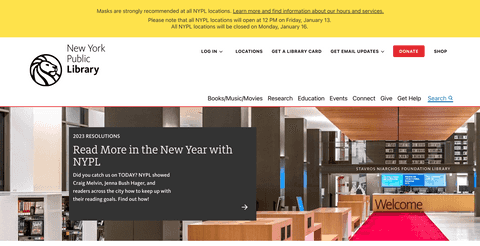
- Good variety of page blocks/components/widgets
- Clean design with good use of red secondary color and line motif
- Generally good responsive design (on various screen sizes)
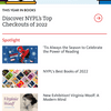
- Users can search the catalog without appearing to leave the NYPL site
- Good use of original imagery (e.g. library card promo)
- Sitewide alert/announcement pane
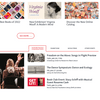
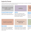
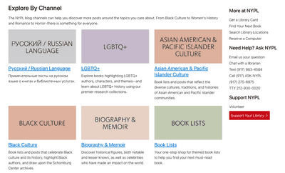
- Ability to explore blog entries by "channel"
- ...and more
What We Don't Like
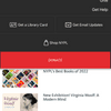
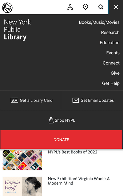
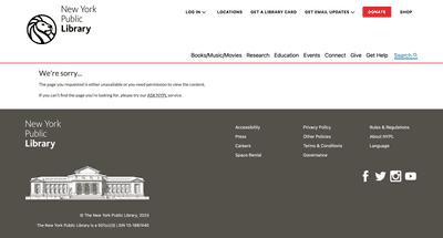
- "Get Email Updates" main menu item appears to be a dropdown but is not
- Must scroll to top or bottom of page to access navigation
- ...and more
Other Observations
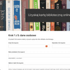
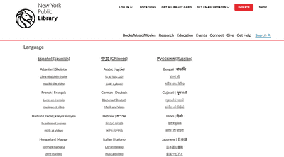
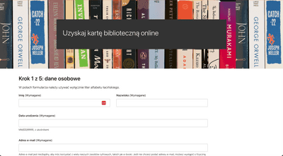
- There is a "Language" page with catalog links for numerous languages and per-language resource pages. Some pages, e.g. library card request form page, have been translated into multiple languages. However, full-site translation appears to be missing/WIP
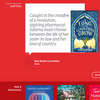
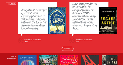
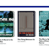
- The book review block with quotes is very compelling; however, it would benefit from some rules for managing longer quotes (note that the initial text for "The Escape Artist" quote is cut off).
- NYPL obviously differs from Acton in size and number of branches/locations
